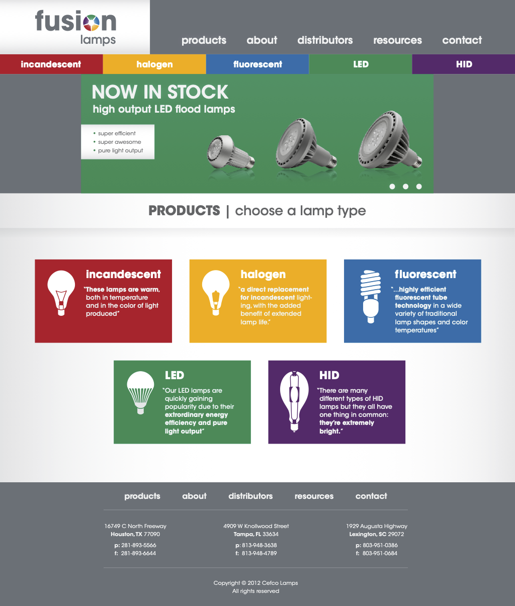
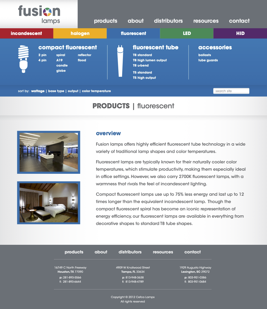
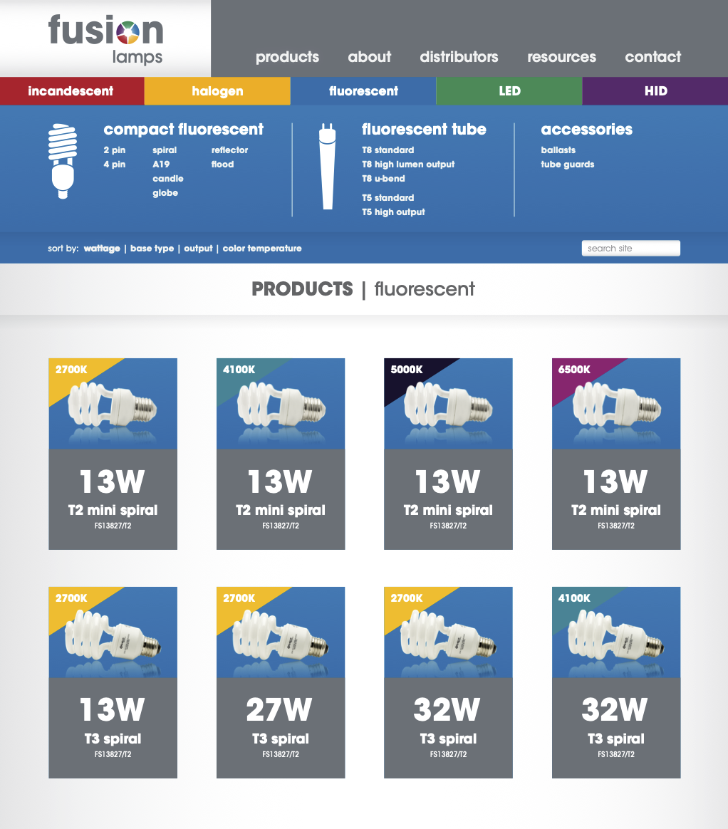
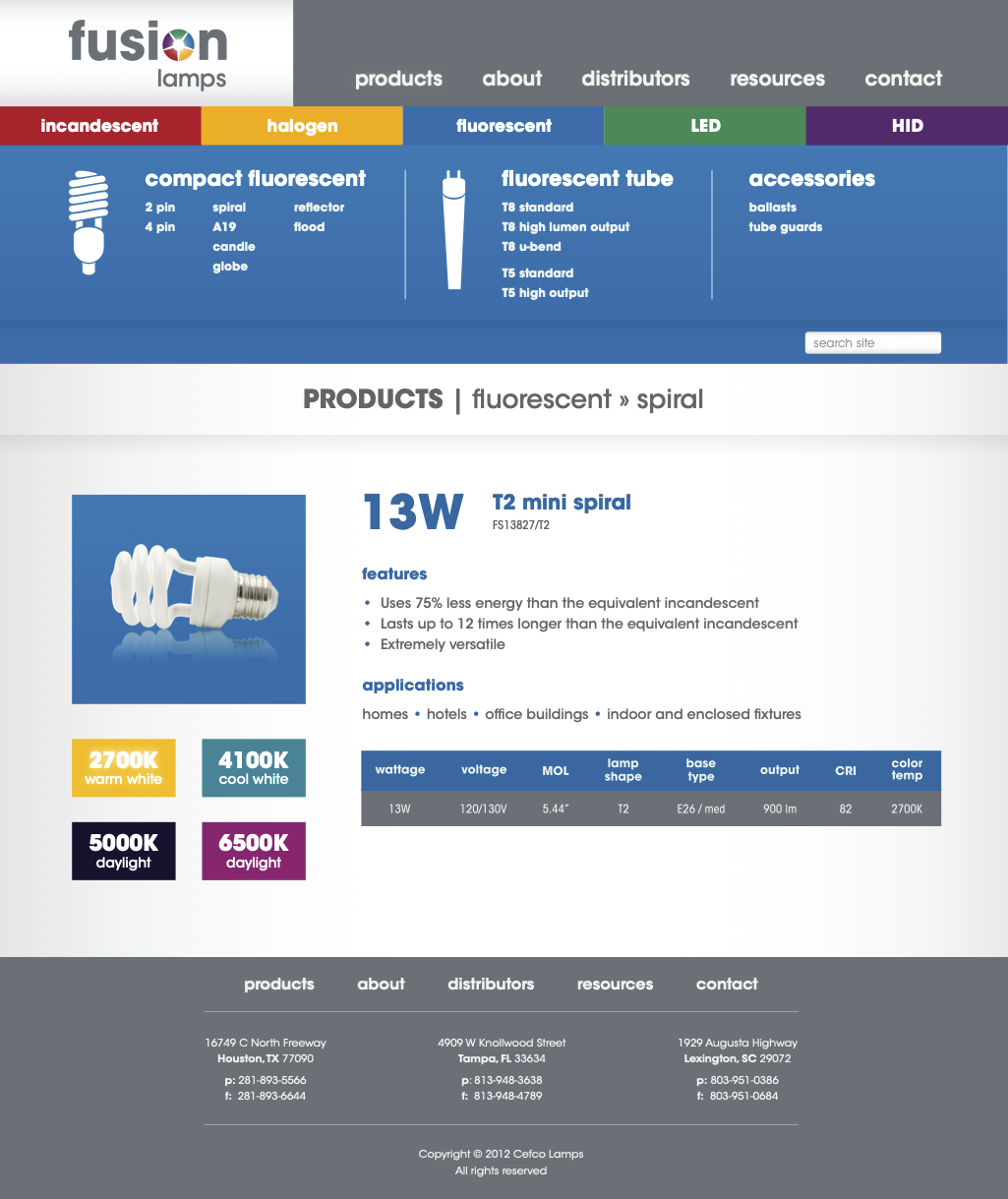
These are mockups for a rebrand and website redesign that I attempted during my first full time gig as lead designer at Cefco, circa 2012. I had mostly been working in Adobe Illustrator at the time — lots of flyers — so that’s what I used for these mockups. This was also before HDPI screens started taking over. As a result, all I have now is low res mockups with blurry edges.
At the time, I had just read the early books by A Book Apart, and found myself super inspired by responsive design, and built the home page in vanilla HTML and CSS (lost to time, unfortunately). Alas, the web development team was in Canada, the branding team was in the UK, my boss was unreceptive, and ultimately my efforts to unify the branding and packaging design were unsuccessful.
It was a valuable learning experience though, and a fond reminder of my early days as a designer.
Need a website or a rebrand?
I’m currently accepting new projects. I’m also happy to talk shop.
Get in touch


